Showing posts with label ui. Show all posts

Wednesday, August 14, 2013

JK everywhere

No, I'm not talking about the author of Harry Potter...  and I'm actually offended that you even considered this.

I'm talking about the keyboard shortcuts "J" and "K" (amongst others) to scroll/jump up and down in lists.
Using J and K to scroll goes back to the vi editor when you used it on old terminals without cursor keys (or maybe probably earlier, but I know them from vi) ... get the history here.

J/K became really popular with Google Reader (RIP), then later Google+ adopted it, Facebook followed as well, then of course feedly as the Google Reader replacement did it, and now I noticed that flickr (with their infamous redesign) at least adopted J/K navigation.

In case you are not familiar with it... J steps/scrolls down to the next post, K goes one step backward to the previous post.
That simple.

Saturday, May 04, 2013

How not to share on Android

This morning my wife told me that one of our favorite restaurant guides for Vienna (Wien, wie es isst) now has an Android app. I knew this app from the iOS version (earlier on my iPod touch) and I had not been impressed by it - largely because of the required paid subscription and lack of features.

Well, half an hour later she found a review of a new restaurant in Vienna, which we decided to try soon, and she wanted to make a note of this (address, phone, ...) in Evernote.
When I saw her typing like there was no tomorrow, I asked here, why she did not simply share this restaurant from the guide app to Evernote.

Well, turns out, you can't.  Because those (strong language deleted here) developers decided not to properly implement the share functionality (with the Android SEND intent), but implement their own.

And guess what happens then: you only implement a view of the share functions / targets... and this is not what Android is supposed to be.

Of course, we can only find Facebook, Twitter and E-mail there, because the developer had no clue that I had e.g. Remember-The-Milk on my smartphone; or Evernote, or Google Keep for that matter, or any other app that might want to receive this information.

Simply freaking share with the SEND intent, please! It is easier, less effort (for the developer) and will actually fit the user's needs and expectations. That's why it is there.

Wednesday, May 01, 2013

One of thoooose popups


So, which is it...
Cancel or Stop ?


Well in this case at least it can be resolved: Cancel cancels the stopping of the download, i.e. resumes the download.

Developers and Designers, listen to me!
You have to pay more attention to  wording and/or translation.

Saturday, February 18, 2012

It's The Little Differences

To quote Vincent Vega:
Vincent: But you know what the funniest thing about Europe iPhone vs Android is?
Jules: What?
Vincent: It's the little differences. I mean, they got the same shit over there that they got here, but it's just-- just there it's a little different.

Like on the iOS virtual keyboard you have the key to switch to numeric on the left:


whereas on [edit: HTC] Android you have it on the right:


For some reason I'm used to the former, i.e. Apple way, and therefore on my [edit: HTC] Android phone I always hide the keyboard...

Wednesday, November 09, 2011

Save icons

Is there any reason - except for convention or tradition - that icons for the Save action are still a 3.5" diskette symbol?

Will today's kids actually understand this?
And when was the last time you saved anything to a "floppy" disk?

Friday, March 04, 2011

Sort order ?

I wonder what the (intended) sort order was here ?

This is the iPhone/iPad app from Austria Airlines...

Is it really that hard ?
How can you sort on the first letter (obviously, because it is sort of grouped by the first letter) but not on the rest ?
The list is neither sorted in English, nor local language, nor the airport codes.

I don't see any sort order here (apart from the initial letter).

Odd.
Stupid.

Sunday, July 11, 2010

Who needs sorting anyway...

Well apparently mobilkom austria[1] does not... at least not in their online shop:

8 - 3 - 5 - 2 - 1.3 - 12

maybe this is a code to a secret message ...
--
[1] sorry, A1 Telekom Austria as of today

Saturday, June 26, 2010

AppTabs Extension for Firefox

Today I finally tried out an extension add-on [1] for Firefox called App Tabs, which has been on my radar for quite a while now.

Not only does it reduce the tab of your favorite apps and sites to an icon (the favicon of your application/site) - thus saving tab space, which leads to a more well arranged tab bar.


It also allows to keep this app permanent, i.e. it keeps you from inadvertently closing those apps, and also opens them automatically when you start Firefox.

All you have to do (after installing the add-on from here) is to go to your favorite sites, and then ctrl-click[2] on the tab... et voilĂ ... it's become an app tab with a fixed app.

Pretty neat.
Love it.

According to the tab bar preview video I posted yesterday, this will become a Firefox 4 feature.
--
[1] sorry, I'm still in old Mozilla-speak
[2] see options of the add-on

Friday, June 25, 2010

Why Tabs are on Top in Firefox 4

Nice overview of the new UI concept / ideas of FF4... and the reasoning behind it.

Wednesday, November 25, 2009

Qando learned how to use the keyboard

Finally, just when I was about to give up on Qando, the mobile info service for public transport in and around Vienna, they fixed their major [1] usability problem on the E71.

Like I reported months ago, they purposely emulated a T9 input even on the full querty/quertz E71 keyboard. So you only could use (by guessing mostly) the numeric keys of the full keyboard...

Finally, they removed that piece of code and seem to rely on S60 and JavaME to handle the keyboard by themselves ;-)

Thanks.
Might become more useful now... I'll be trying it.

GPS still does not work, btw...

--
[1] and we are talking really MAJOR MAJOR here

Tuesday, September 29, 2009

Yet another E71 discovery


... a bit embarrassing, to be honest.

I've been using my Nokia E71 now for about a year now, and only today discovered that I can delete an item in a list, e.g. SMS, eMail, Todos ... simply be pressing the delete button.

Until today, I always went through the menu...

Saturday, September 12, 2009

Some E71 shortcuts

Here are some keyboard shortcuts for the E71 I discovered:

General:
  • Press & hold * (star)
    Turn on/off Bluetooth... quite handy
  • Press & hold #(hash)
    Should switch between general and silent profile,
    but does switch between line #1 and line #2 on mine
    I'd have preferred the profile switch...
In text edit / messaging:
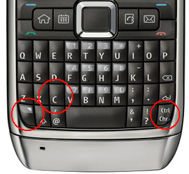
  • Fn-Ctrl-C [1]
    Clipboard Copy
  • Fn-Ctrl-V
    Clipboard Paste
  • Fn-Ctrl-X
    Clipboard Cut
Useful... yes, sort of...

But try hitting [Fn] [Ctrl] and [C] (or V or X) at the same time... and still hold the phone in one hand...
Almost impossible... see where those keys are located:


Lucky however, that you don't have to press and hold them at the same time. Fn, then Ctrl, then C/V/X is OK... so you can do it quite easily.
--
[1] Ctrl being Chr/Ctrl or Alt/Strg (on German keyboard) - the key in the very lower right corner

Tuesday, September 08, 2009

E71 usability

Just by accident I noticed that you can select (="mark") elements on a list on the E71 by holding the shift-key while scrolling over the items.... just like on Windows (and others).
Very convenient in the messaging application (SMS, email).

Don't know why I did it... I didn't try on purpose... I guess I just did it, because that's the way it ought to be...
Sad thing is, I noticed only after about a year...

Monday, July 20, 2009

Qando being really really stupid

Qando is an excellent service for quering up to date (and realtime) information about the (mainly) Viennese public transport.
I used to know it from the iPhone - or rather from my iPod touch only, where it was not THAT useful, because it only worked when I had a WiFi connection ... it does an excellent job on a fully GPRS/3G connected iPhone, though.

Found out that it is also available as a JavaME version for more or less or other handsets, including my E71.

Installs OK, starts fine, however, it could NOT access my GPS device (a common problem for JavaME apps).

But I wouldn't even let me enter station/address data by hand.
There is a search input field, but I failed miserably to enter anything there...

...except for numbers, I found out after a while.

And then I played with it a little more, and noticed that - get this! - emulate a T9 input, even when the phone has a full QWERTY keyboard!
So if I hit e.g. the 4-key 3 times it will walk through g-h-i... like it would on a 12 key phone[1].

Aaaaaa... how stupid can one be as a programmer. Who in this century (or the last 20-30 years for that mattters) codes keyboard input and key-stroke-decoding by hand! Let the opsys do that! That's what it is here for. Even on a phone.

So please, Qando programmers, you can do better! And it's a lot easier for you!
--
[1] or whatever the correct number of keys on a numeric-pad-only phone is.

Sunday, August 31, 2008

GUI broken ?

Isn't a GUI utterly broken, when the status bar (of the main window (!)) says "Opening Main Window..." for half a minute ?

Monday, June 09, 2008

Interesting error page

While an Apple conference (and iPhone 3G announcement) is bringing twitter down (as expected), I found a more entertaining error page:


Very helpful. Thanks.

Sunday, June 08, 2008

Good color coding

I like the way SourceForge.net tells my that the password I entered was wrong:


A green check mark ...

That's how you indicate an error. Not this panicky red or yellow stuff

Friday, May 09, 2008

Stupid UIs

Another addition to the collection of stupid user interfaces.

This week's award goes to Nokia for replacing a YES/NO dialog with two buttons (green checkbox for YES, red crossy thingy for NO).
Well, it is intuitive, but keyboard shortcuts (Y, N) no longer work.

Well done.
Thank you.

Friday, March 21, 2008

Flickr mobile soo different from (full) flickr

Why is this ?

Look at the regular Flickr home page:

You have a clear structure there.
  1. upload
  2. your photos / recent-activity / comments
  3. photos from contacts
  4. everyone else
  5. your groups
On Flickr mobile you have

  1. recent activity
  2. photos from contacts
  3. comments
  4. upload
  5. your photos
  6. everyone else
  7. explore
  8. your contacts
or, if I use the numbers from full flickr.
2b. 3. 2c. 1. 2a. 4. na na


But why ?

I understand that options 7 and 8 are added, because in the full flickr interface they are in the javascript drop down menus. Hard to do on a mobile.
But why change the order and structure of the other items ? Why not keep them in sync ?

And most importantly: why do I care ?

Can't say, but just annoys me.

Saturday, April 14, 2007

Small (UI) change, big impact


Xing, my favorite professional network site, introduced a nice little change in their userinterface recently.

When working with lists (of contacts, etc) the pagination looked like this (my rendering):


Notice the ellipsis between 5 and 20 and that the continue link/button is the rightmost. This meant that when you went from page to page, the page numbers and their width would not stay the same and the exact location of the continue link would change its position. Which was exactly the link you are using to navigate to the next page...
Which essentially meant that you had to look closely at this pagination links every time you wanted to go the next page, instead of just (blindly) clicking forward.

They changed it to that:

So now (finally) the continue link will always stay on the same spot and you can (blindly) stroll through the whole list.

Small change, big impact (to me).

Thanks a lot.